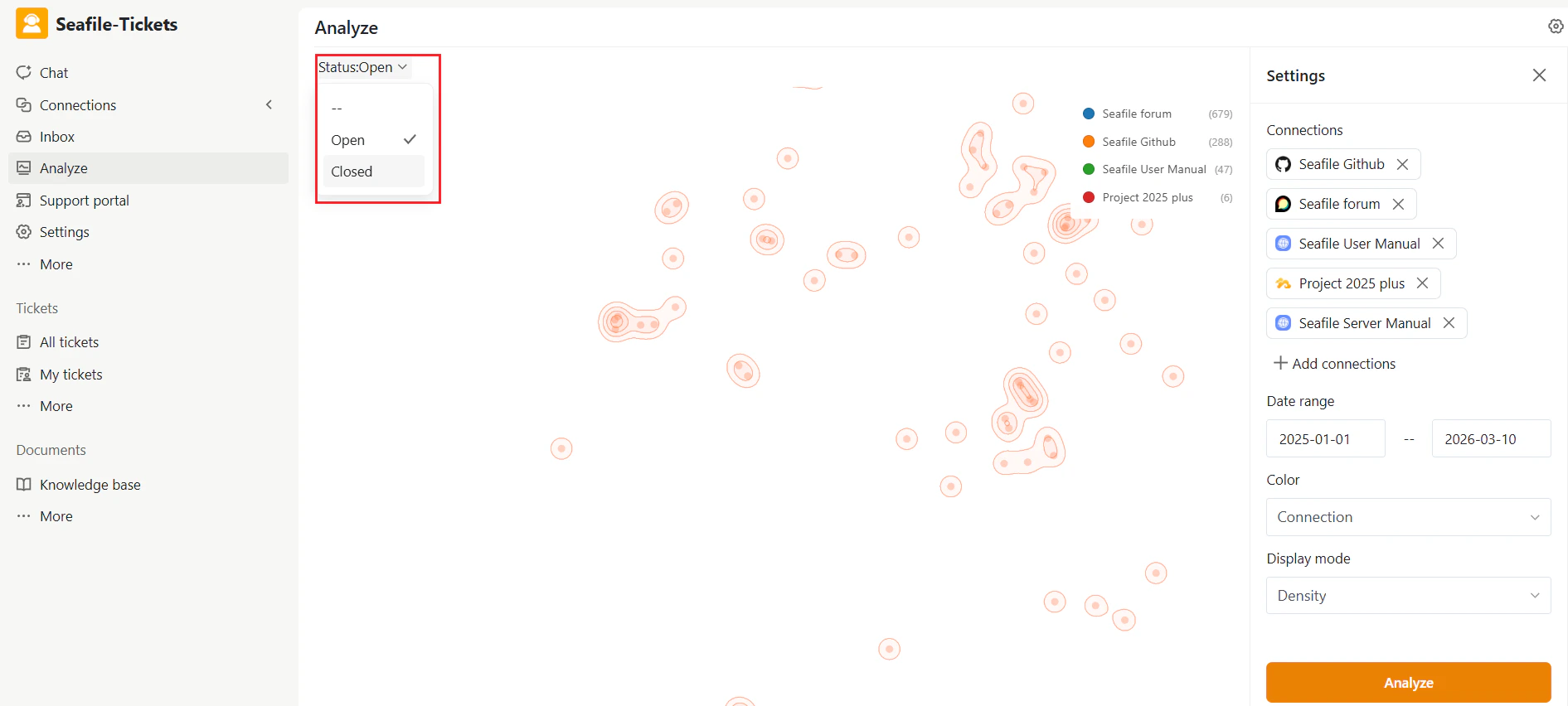

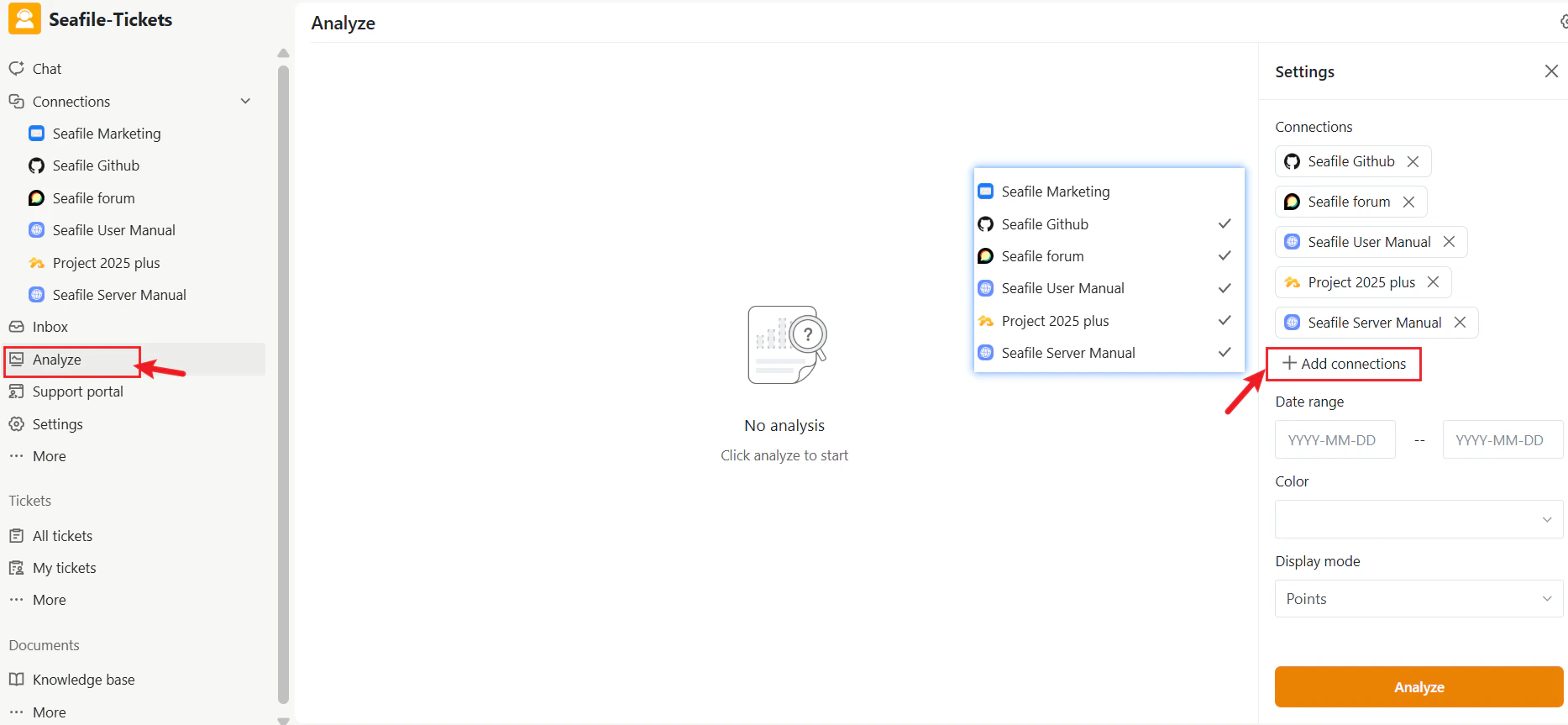
Accessing Analyze Function
- Open the project workspace.
- In the left navigation menu, click Analyze.
- Topic Map (center) — displays dataset and topic clusters.
- Settings panel (right) — lets you filter and adjust how data appears
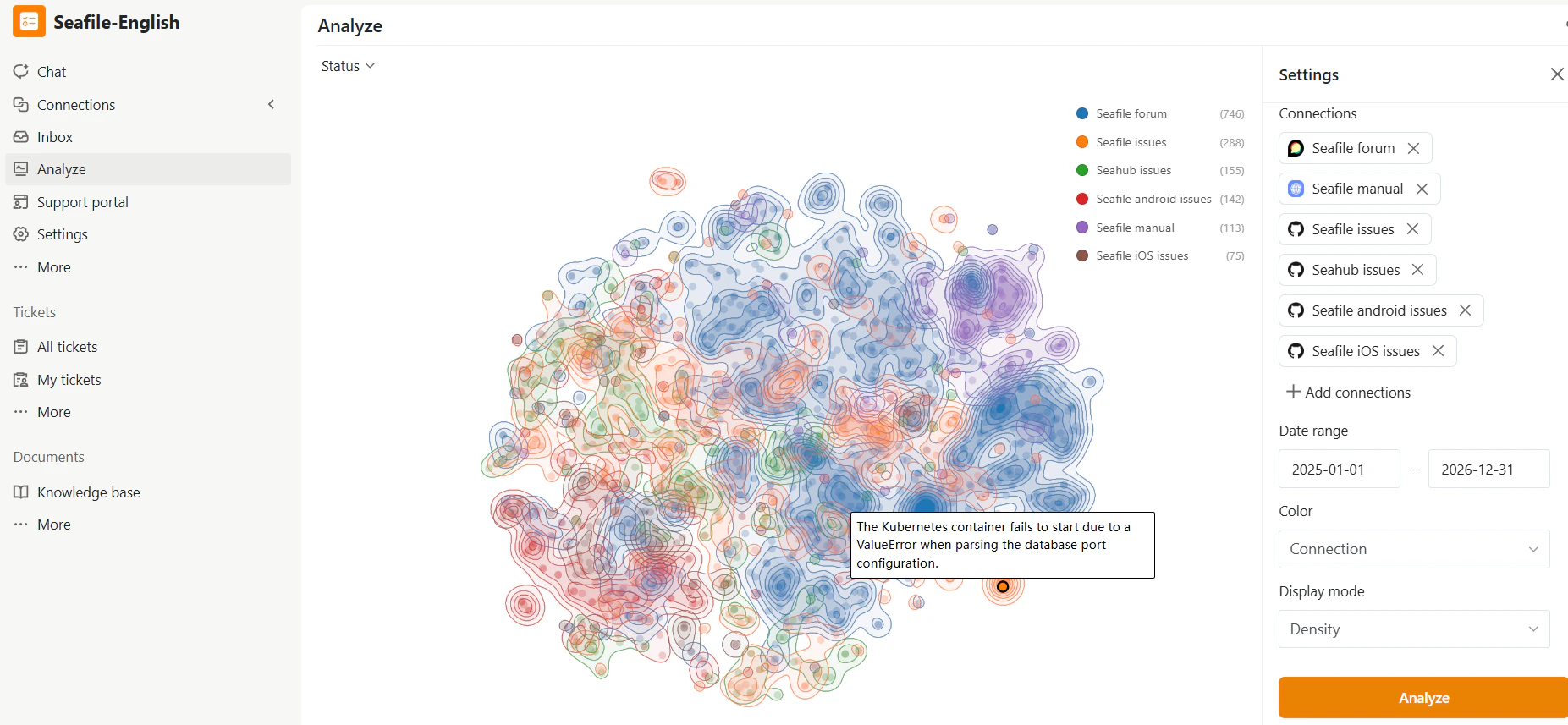
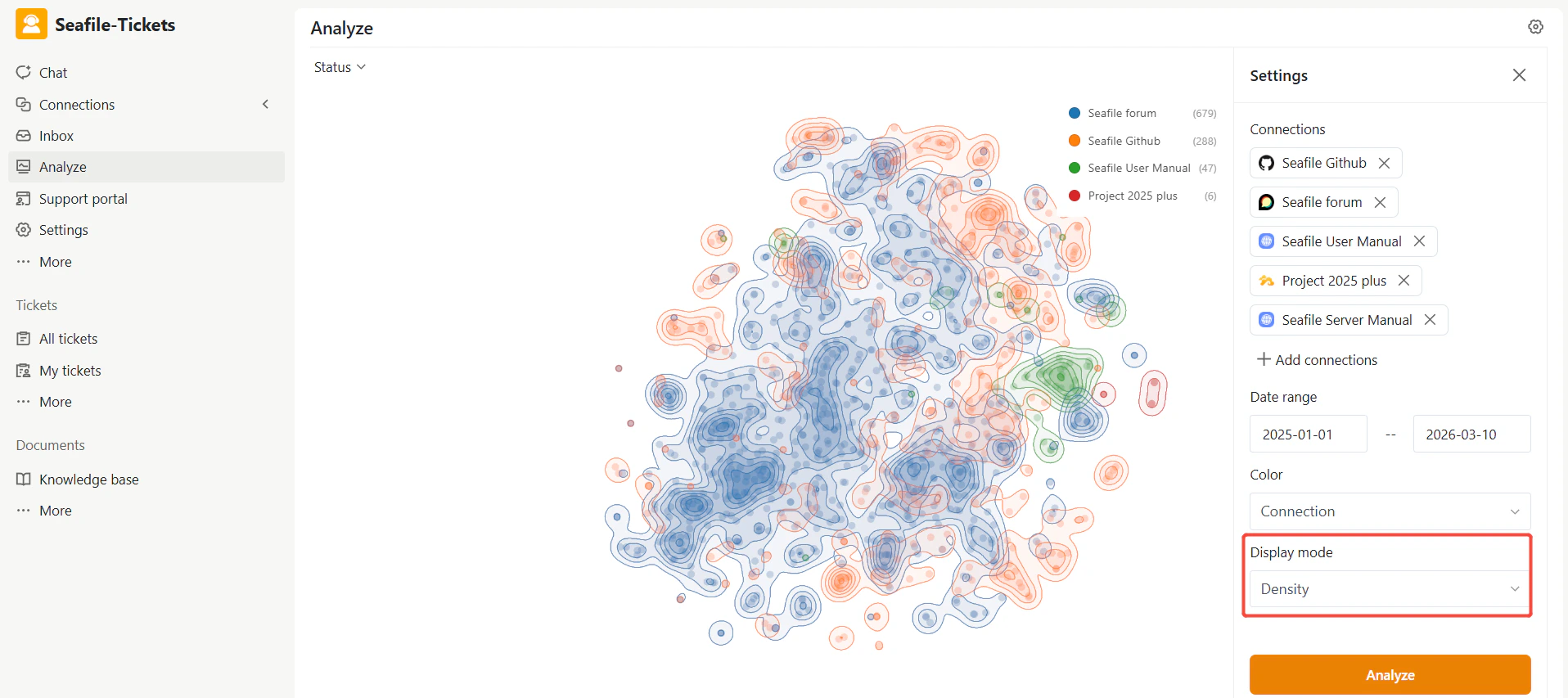
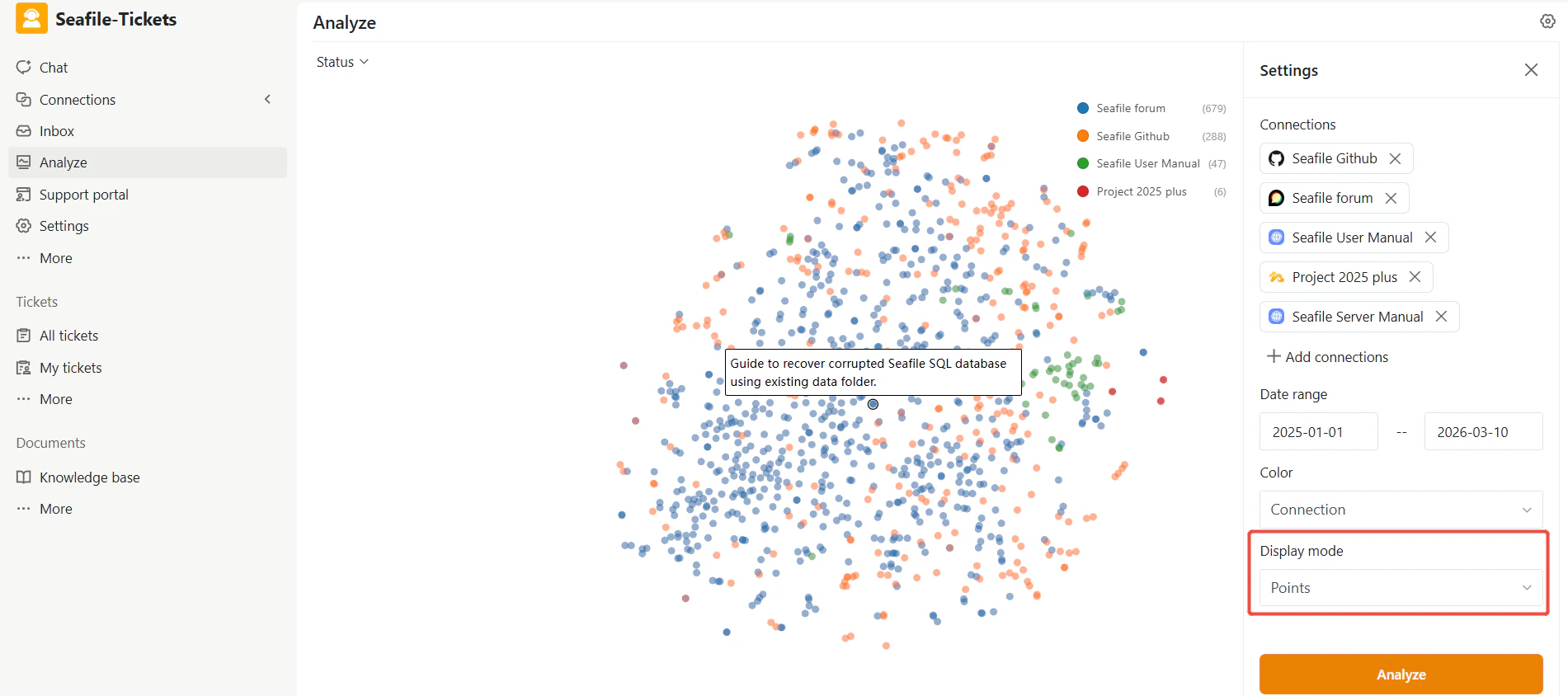
Topic Map
The topic map is the central visualization for exploring support conversations. Each item appears as a point on the map, with items of similar content clustered together. Display Modes:- Points: Displays each item individually for detailed inspection.
- Density: Uses a heatmap-style view to highlight areas with concentrated items.
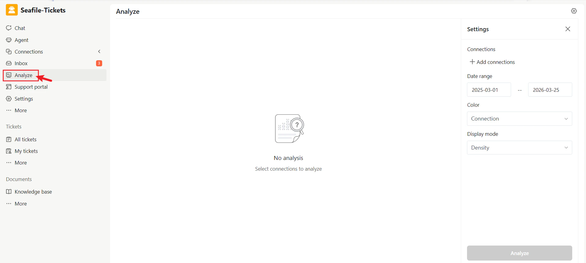
Settings Panel
The Settings Panel allows you to configure which items appear and how they are displayed. Changes are applied after clicking Analyze.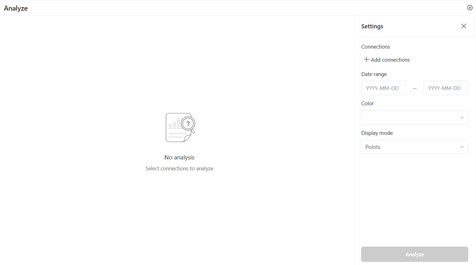
Connections
Connections determine which sources are included in the analysis. Examples include:- Forum discussions
- GitHub issues
- Product documentation
- Open the Connections section.
- Select the sources you want to include.
- Remove a source by clicking the × icon next to it.
- Click Add connections to include additional sources.
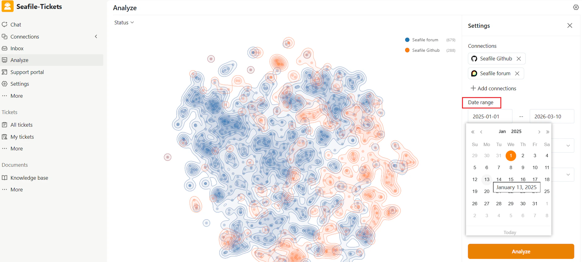
Date Range
The Date range filter limits the analysis to items created within a specific period. Use this to:- Analyze feedback for a particular release cycle
- Investigate recent support activity
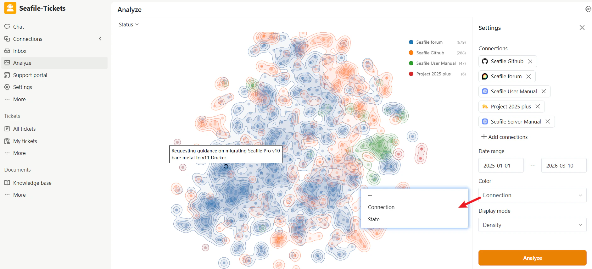
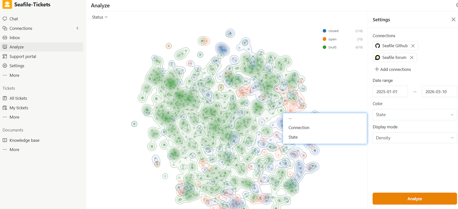
Color
The Color option determines how items are visually grouped on the map. Common options include:- Connection — Each data source appears in a different color, helping you see how topics are distributed across sources like forums and GitHub. Hovering over a point shows the title of that specific issue.
- State — Items are colored by their status (Open, Closed, etc.), letting you quickly identify clusters of unresolved issues.
Display Mode
The Display mode controls how the topic map renders. Two options are available:- Density — Shows a heatmap-like visualization highlighting areas where many related items concentrate. Use this to quickly identify major topic clusters.
- Points — Displays each item as an individual point. Use this when exploring specific issues or discussions.
Status Filter
The Status filter at the top of the page lets you focus on items with a specific state. Available options typically include:- Open — Items that are still unresolved
- Closed — Resolved or completed items