

Documentation Index
Fetch the complete documentation index at: https://user-docs.seaticket.ai/llms.txt
Use this file to discover all available pages before exploring further.
The topic map lets you visually explore how support conversations relate to each other.
Several visual cues help you interpret the map.
Points
Each point represents a single item, such as a forum topic or issue report.
- Points located close together usually discuss similar topics.
- Hovering over a point displays a short preview of the content.
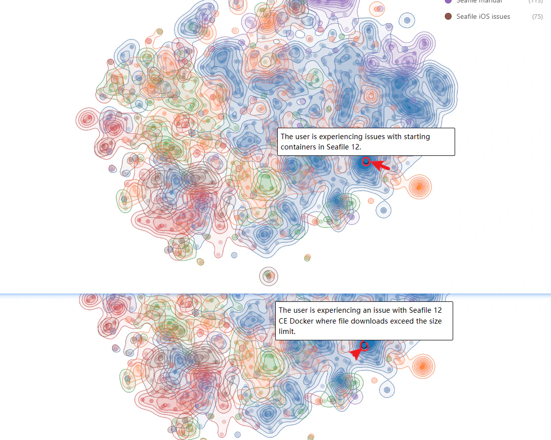
Clusters
Clusters form when many items share similar content.
- Large clusters often indicate frequently discussed issues or question.
- Exploring clusters can help identify recurring support topics.
Density Areas
When using Density mode, areas with many related items appear as darker or more concentrated regions, typically indicating major discussion themes within the dataset.
Color Groups
Colors represent grouping categories such as connections or item states. For example:
- Different colors may represent different platforms.
- Colors may indicate whether issues are open or closed.
This allows you to quickly compare patterns across sources or statuses.
Discovering Insights
Teams can use the Analyze view to better understand user feedback and support trends.
Identify common user issues
Large clusters often correspond to frequently reported problems. Reviewing these clusters can reveal which issues affect the most users.
Monitor discussion trends
Adjusting the date range helps you observe how user feedback changes over time, which is useful when evaluating the impact of product updates.
Compare multiple platforms
By enabling multiple connections, you can compare how topics appear across different sources, such as forums and GitHub issues. This can show whether certain issues are more commonly reported in one channel.
Prioritize support and product improvements
Clusters containing many open issues may indicate areas that require attention, helping teams prioritize fixes or improvements.